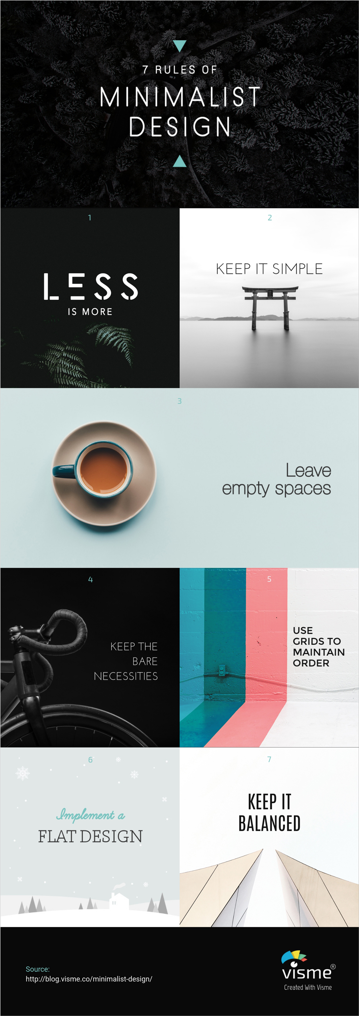
Beautiful Practical Example of a Minimalist Design
A graphic design minimalist can be described as the stripping away of all unnecessary elements and focusing on what needs to be there. In this sense, minimalism encourages purpose.
While minimalism often appears simple on the outside, a lot of thought, practice and time go into the production and development of a minimalistic piece. So, here are some ways you can get the most out of minimalism.
1. Graphic Design Minimalist

All in all, flat design helps to focus more on the content, without distracting the viewers from the visual effects. It emphasizes the simplicity of elements and at the same time makes the interfaces more responsive, faster and easier to use.
Minimalist graphic design is an idea of creating something where every element serves a purpose. It is simple, clean and beautiful. It is used a lot. These designs are easy for users to understand and engage with. We’ll take a look at minimalist graphic design with ten tips for doing it well, plus examples of those principles in action.
What is Minimalist Design?
A minimalist design can be identified by a concept that is simple in nature. Only the important elements for performance are included in the design.
Features such as color and typography are also used. They highlight the simplicity and clean design. Details and space are design factors that really rule the aesthetic. Because there are not a lot of elements to work with, every design divot is on display.
The minimalist graphic design follows a few key rules. When creating your next project, be sure to refer to this checklist. Keep in mind that sometimes a minimalist design can work against you if there is no balance or if the empty spaces are too stark and overwhelming. Remember to keep it balanced, and that is a rule for all types of design.
- Less is more
- Keep it simple
- Leave empty spaces
- Use only the bare necessities
- Implement a flat design
- Keep it balanced
- Use grids to maintain order